Reflections on ASLA 2025 Energise. Empower. Explore.
This weekend I attended my first national-level teacher librarian (TL) conference. I regret that I waited until after my time as a practicing TL to do so.
The conference ran on Friday and Saturday with some pre-conference events on Thursday. I arrived in time to attend the pre-conferencing networking session at Little Creatures brewpub. In a convivial, lighthearted atmosphere I was able to meet other delegates and sponsors and begin to make the connections that would be strengthened over the course of the weekend.


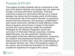
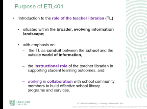
It was a privilege to meet with many current and former CSU students who came to our sponsor’s table to share their experiences at the University and what they were doing currently. I was proud of the thoughtful, empowered teacher librarians and those who were taking a different course – whether that was in public or academic libraries, in school library-related industries, or in pursuing further study. A common theme that arose was how elements of the MEd(TL) course material was being used in the day-to-day work of teacher librarians – whether it was research methodologies providing common terms of reference with a science teacher or advocacy and leadership within the school context, CSU students and alumni were applying their education.

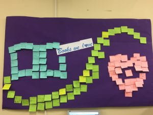
I attended some sessions – exploring a panel on digital and media literacy, a session on advocacy, and various research and practical projects surrounding reading culture and supporting reading through school libraries and community partnerships. But the most empowering and energising aspect of the weekend was making connections with CSU students, alumni, other teacher librarians and school library professionals and sponsors (technical support providers, authors, illustrators, booksellers and more).
To me that opportunity for connection is the prime factor for becoming involved in professional associations. If you are a teacher librarian reading this – please join some form (local, state, national, international) of professional network or association and participate in the events and resources it offers. You will find yourself energised, empowered and ready for exploration! I hope to see you at a conference or summit soon!


 Source:

 HD wallpaper: person drawing angel, kids, child, children, elementary, little kids 360x640px (480P) free download from wallpaperflare.com_wallpaper(2)